Building the Minimum Badass User

Ditching the title numbering system because that’s too boring.

Kathy Sierra’s video was unexpectedly educational. I suggest you watch it. She said that we shouldn’t be focusing on making the app – or whatever else – awesome, although that does help. We need to focus on making the user a badass. Apparently, that’s quite easy to do.

I have to apply that philosophy to a present project. Being a cat person, I’m working on designing a classy cat shampoo for people who don’t want something with a corny name and a badly photoshopped picture of a cat on the front.

The instructions on my product were initially very brief and to the point, making it seem like washing your cat is a walk in the park. It’s not, and it never will be, if you keep doing it the traditional way. By making the shampoo a spray-on that requires no water and giving better instructions with more adjectives and articles (grammatical articles, not written articles) hopefully the cat owner will feel like she’s gifted in the art of cat washing and instruction deciphering, and thereby will feel awesome because she didn’t get clawed at too excessively.
Who Owns Your UX Philosophy? – Activity 5

The last activity – for last week, anyhow – requires the reading of this mercifully short article and a perusal of the comments.

I have done so, and came to the unoriginal conclusion that there is a ridiculous amount of thinking to be put into making an app. (This is almost completely off topic, but the best gem I found in the comments was a bloke repeating something that his wife said – “Before I walk a mile in someone else’s shoes, I find that I must first remove my own.” Talk about depth. Blew my tiny mind. Never even heard that version before.)

So, to tuck it neatly inside the hardened walls of a dry fruit seed’s ovary, UI is how something looks and behaves, and UX is how we react to that. Good user interfaces are achieved through designing them to suit our ways of thinking and perceiving, and good user experience is achieved through a good user interface. It’s difficult to have one without the other. In order for something to meet the expectations of us humans, we have to go through a lot of surveying and studying to get the UX right before launching ahead with the UI, or it’ll go pear-shaped. If you go to all the trouble of designing something without first researching into what people perceive as appropriate and it makes no sense, you’re going to look like a twonk and the UX is going to be disastrous. Think ahead, wear other people’s shoes, and give both UI and UX equal places in your life, because then everything will be peachy.

Less Aesthetic, More Design – Activity 4

The activity is to take a survey of my favourite and daily used apps on my mobile, tablet or laptop and identify which ones excel in both aesthetics and usability and which ones fall somewhere in-between. I don’t use many apps, so this was surprisingly difficult, but here it is –

Looks average but works well: Candy Crush, and the mail app that comes with android phones, which is simple and easy to use, but not particularly aesthetic.

Looks good and works well: Yellow Pages and Gmail.

Looks great but doesn’t work well: the Bamboo Paper app. The colour menu thing pops up at the drop of a hat whenever I’m trying to sketch something, and it keeps force closing. That could just be the iPad, but it’s irritating nonetheless.

Flat Pixels: The Battle Between Flat Design and Skeuomorphism – Activity 2

Read this.

My task is now to resurrect a previous project of either flat or skeuomorphic tendencies and make it lean the other way.

Now look below.

original logo


A very obviously flat logo designed for a school project. It’s basically a small section of San Francisco made to look like a stylised map. Removing the word “stylised” effectively changes the design from flat to skeuomorphic. Like so:

skeu'd logo


By putting the folds in there, it resembles an actual map. Hence, it now belongs to the mystical and barely pronounceable cult of skeuomorphism.

UI and Capability – Activity 3

Anyone with half a grasp on numbers and how they work will notice that I skipped Activity 2. Well, yes and no. I’ll get around to it. Meanwhile, here’s 3.

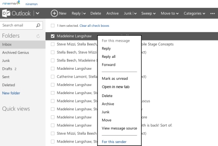
“Take a moment and think about your most used web or device app.” Hands down, would have to be Outlook. Since emails are something I send and receive on a daily basis, I would prefer Outlook to cater a little more to people who’ve got ten emails to reply to simply by incorporating an “open in new tab” button. If there already is one, they’ve concealed it remarkably well, so forgive me if I’m barking up a non-existent tree here. Anyhow, here’s my super-quickly-done solution:

revision

I didn’t have the font, so it stands out like a sore thumb, which is apparently a pretty noticeable ailment. Don’t ask me why.

The end.

UI Design with a Purpose – Activity 1

No to NoUI – a passionate and subjective article on invisible UI, and, in a nutshell, how it has no place in this world. Having read through the article, I was tasked to consider the differences and similarities between ‘invisible design’ and UI design that is ‘visually beautiful’. With that in mind I must answer the following question – can both meet the goal of great experience when properly balanced? My immediate answer is yes, and seeing as the article was subjective, I’m allowing my reply to feature a few more personal pronouns than usual with a lot of personal opinion behind them. There’s a place for beautiful interfaces, and there’s a place for no interfaces.  The writer of this article is a little too adamant upon the subject, so it could largely be my perversity speaking here, but I think that there is plenty of room for the best interface to be no interface. It all depends on the product, in the end, and who the target market is.

Activity 4 – Learning from “Bad” UI

Mission: Find an app that has delivered speed as part of its experience. I chose Yellow Pages. Having grown up with the overly complex Yellow Pages phonebook, the app is a already a huge step forward in that it lacks physical pages, which in itself makes it less of an agony to use. Rather than having to thumb through till you land on the approximate location you’re looking for and then spend ages flicking between the relevant pages, it’s simply a matter of typing what you want and where you want to find it literally as soon as you’ve fired up the app. Couldn’t be simpler or quicker.

Activity 3 – Designing for the Next Step

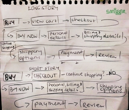
The task was to read an article, gain some knowledge, map out a common checkout flow, then find ways to make it less time-consuming and more communicative toward actions to take.

The long story is an original checkout flow, the short story is my minor modification.

checkout flow

Shoving the details onto the one page and merging the view cart/checkout pages were basic simplifications, but consume slightly less time by maybe seven to ten seconds, which accumulates into lots of seconds when you’re a frequent shopper online.

Activity 2 – Visual Hierarchy and Weight

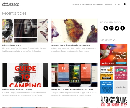
The article on visual hierarchy, despite having an awkwardly named web address (52weeksofux) was very helpful in establishing how a website, or any design, for that matter, should have certain elements bolder and more apparent than others. abduzeedo is a site that posts tutorials and inspirational material from other designers and artists, so it’s useful as well as attractive. Ish. Regarding visual hierarchy and weight,  a few things could be improved.original

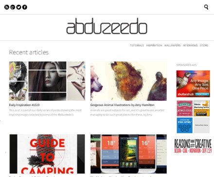
The name “abduzeedo” isn’t quite big enough. If you weren’t paying attention – and I rarely do – you’d probably overlook the name altogether. The links to other media sites are just a tad too attention-seeking placed where they are, and the advertisements are also too noticeable. So I tweaked it to fit my own standards and to abide by the laws of visual hierarchy by making the name of the site bigger, reducing the size of the ads, and placing the links along the top, which is usually where people expect to find them.

my version

Defining and Expanding User Experience – Activity 1

I was asked to write down my definition of design on a stick-it note. I came up with “making something work well and hopefully look good at the same time”. Following that, I had to peruse an article by Oliver Reichenstein, then write again, with the same pen and a new stick-it note, what I felt design was. I am marginally enlightened and now know some inspirational quotes, but my second definition is much the same as the first, with an extension: “… without being too subjective.”